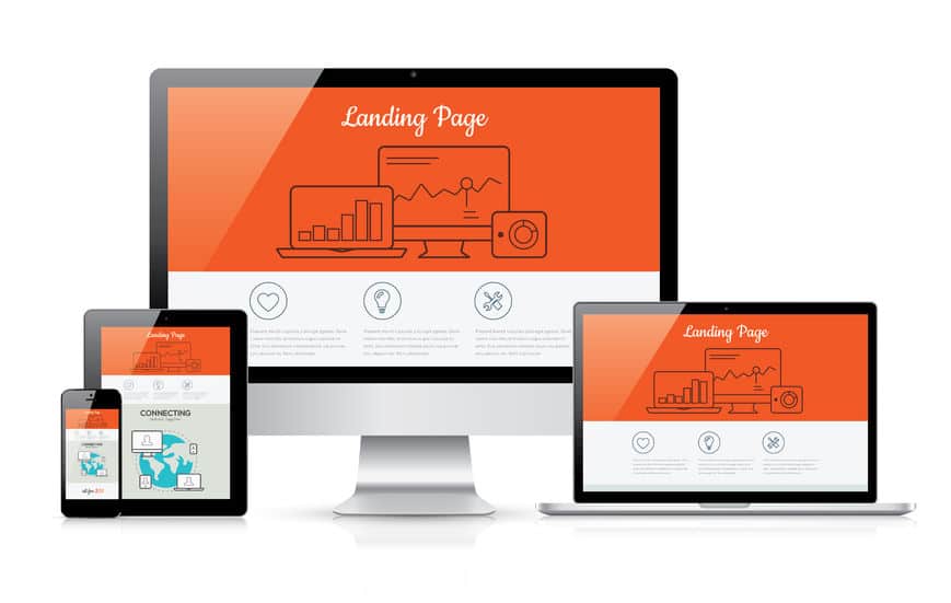
What is a “landing page”? It’s the page of your website that people land on after clicking your ad. Should that be your home page? Maybe, but maybe not. Having the right info on a landing page DRAMATICALLY increases your conversions (getting people to take the next step).

Here are some tips for what makes a great landing page:
1. It should relate to the ad you are running. Whatever offer or information you are featuring in your ad should be prominently featured on the landing page. Don’t make people hunt for the info.
2. It should not be overly cluttered. Think about it from a prospective customer’s point of view. What info would you find most helpful if you were the customer?
3. Is it clear what the next step is that you want the potential customer to do? Fill out a form? Click on a button? (forms should be kept to 3 or 3 fields maximum, asking for phone number reduces form fill-outs by 50%) Click here for more info on this.
4. Have a clear, prominent headline and then use a subheading for more explanation. Don’t just have a form with no content, that intimidates people.
5. Use the word “you”. It makes your content feel personal to visitors. Use the word “because”. That word signals you are explaining to visitors why they should take a specific next step.
6. Showcase what you can do for THEM, don’t bore them with details about why you are so great. Research shows that you have a maximum of 8 seconds to convince visitors to stay on your page so get to the point.
7. Use quality images. Images are eye catching and grab attention. A landing page should NEVER be all text. Test out different colors for your call to action button. It should contrast sharply with your background to stand out.
8. Have a quality offer. Don’t be gimmicky.
9. Showcase a testimonial quote or review.
10. Make sure your landing page looks good on mobile. Test it out on your phone. Having a great mobile page can double your conversions. It should take less than one second to load.
11. If you have a person filling out a form, does a thank you page display after they submit it? It should! And the thank you page can contain info about other offerings you have.
12. Have a Live Chat box on your landing page. People overwhelmingly prefer to interact with a human versus filling something out online.
