Put and End to Pinching and Zooming With a Mobile Optimized Site
As mobile internet use continue to skyrocket among the large population of digital device users, it becomes more difficult for brands to maintain their websites to keep up with the ever-changing and developing new devices. While having a user-friendly site is a benefit to web users, it can be a burden to web developers and business owners who struggle on finding a way to reach their users on all platforms.
With more devices like tablets and smartphones that can reach even larger audiences, each device needs to offer the same user experience that is effective and leads to an equally high number of conversions as the traditional desktop computer.
According to Acceleration Partners, the best way to capture users and convert traffic for your brand on every device is to be knowledgeable about all web designs options: responsive web design, mobile website and a dedicated app, and be aware of their pros and cons.
Responsive Design- A website with a responsive design dynamically adapts websites to different screen sizes, such as tablet and smartphone, by leveraging one set of code. This allows the user to have a seamless transition between each device because the site actually looks the exact same on all devices.
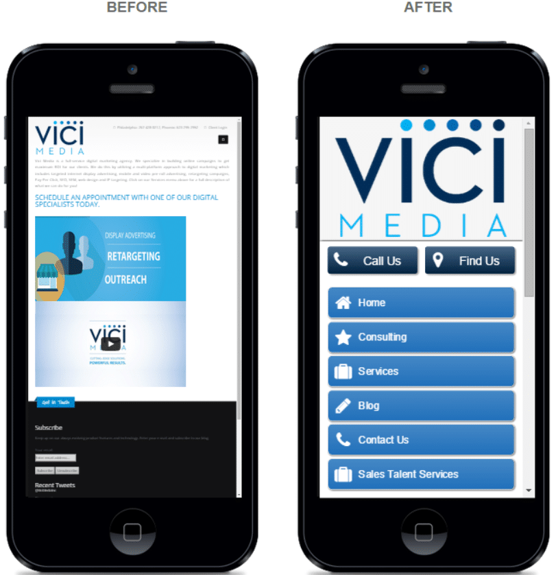
Mobile Websites and Apps- Mobile websites and apps are similar in that they involve developing a completely new framework for your primary site that is tailored into a mobile-friendly dimension. While a completely new redesign and transition to a “new dimension” may seem intimidating to some site owners, the time and costs ultimately outweigh the cons and slightly outweigh the benefits of a responsive website.
Responsive websites have a “one size fits all” point of view on web design. To many businesses that need a web development, that approach seems quick, convenient and effective. What they don’t think about in a “one size fits all” approach is that most desktop screens are about 4 times larger than a mobile screen! That means mobile users will have to pinch, zoom and move all around a site just to see the web view that a user on a desktop would see.
For these reasons, mobile users are still wary of trusting web browsing on a mobile phone as opposed to their comfort zone of a desktop screen. According to Acceleration Partners, responsive websites are “pretty good” and “just fine,” but a “one size fits all” in the web design world is only a myth.
Websites need to be simple and easy to navigate and until responsive web design makes major advances to fulfill the needs of all new digital device. Although a new mobile web design may seem intimidating, costly and time consuming, it is sure to be worth the long-term investment, for both you and your customer.
Related Posts
 Make Your Website Mobile-Friendly by April 21 or Lose Traffic
- Mobile Window Shopping: Look but Don’t Buy
- Your 2015 New Year’s Resolution: Effective Marketing
- What Are Top Digital Advertising Industries For 2019? (Example)
- 2015: The Year of Mobile Marketing
- Desktop Reigns Supreme in Ecommerce Traffic and Revenue


